DESIGN PROCESS
During the Game Theory ARG I wanted to challenge the players to decode an entirely new cryptic alphabet. I worked closely with some talented artists at Secret 6 to mock-up what that could look like.
After providing an initial set of references of character styles, we went through waves of designs that we slowly chiseled away with each iteration.
See below for the full design process.
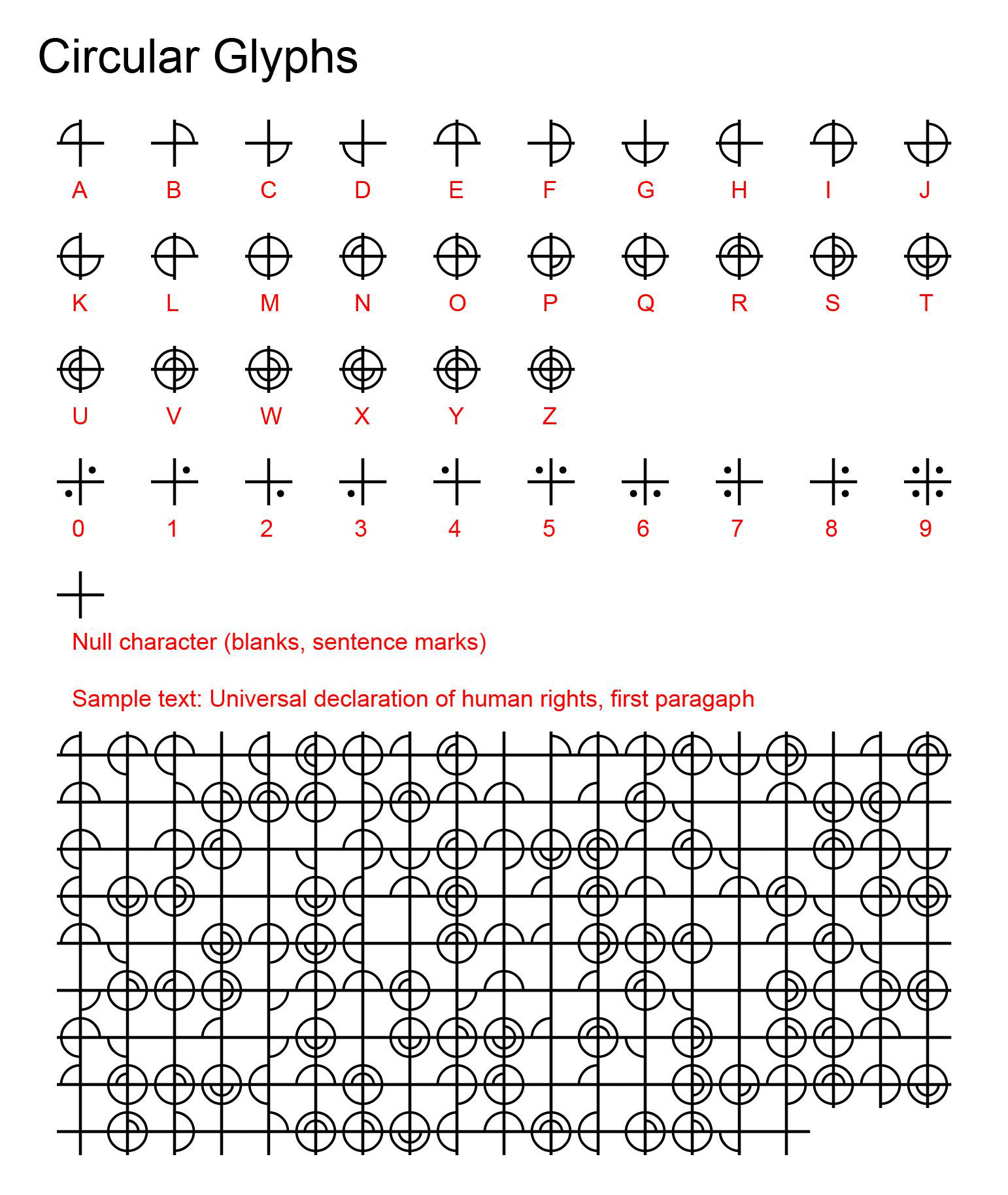
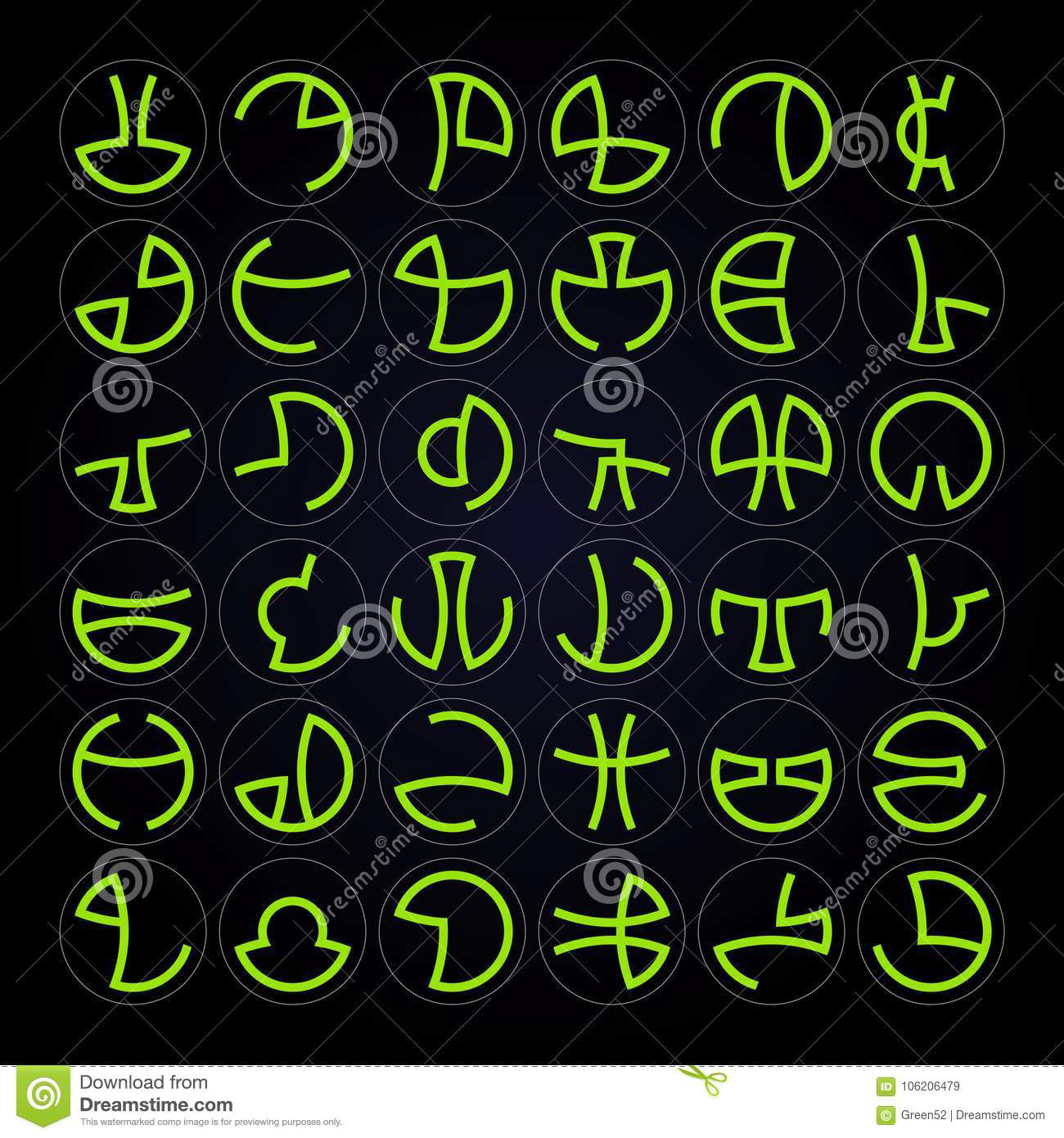
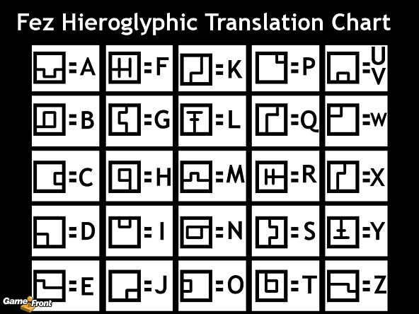
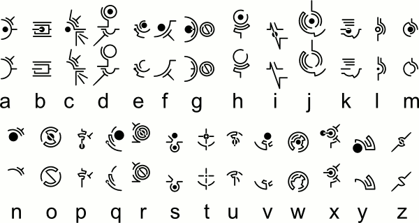
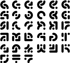
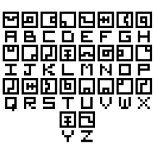
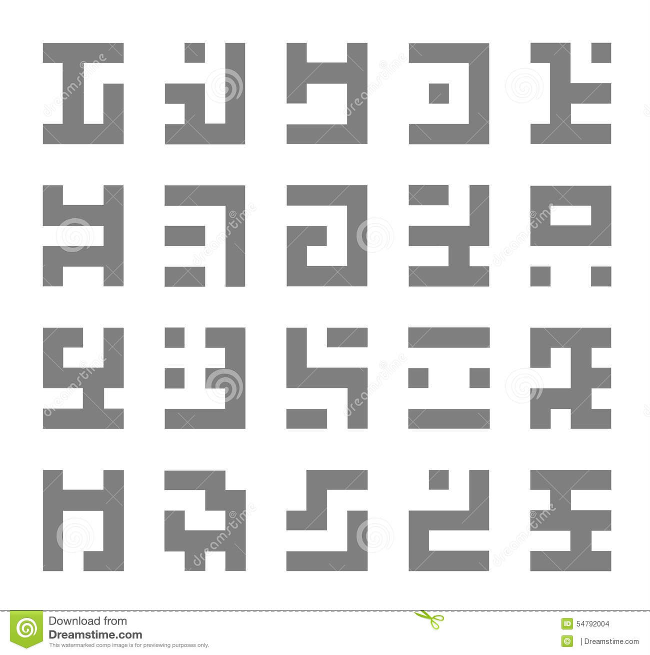
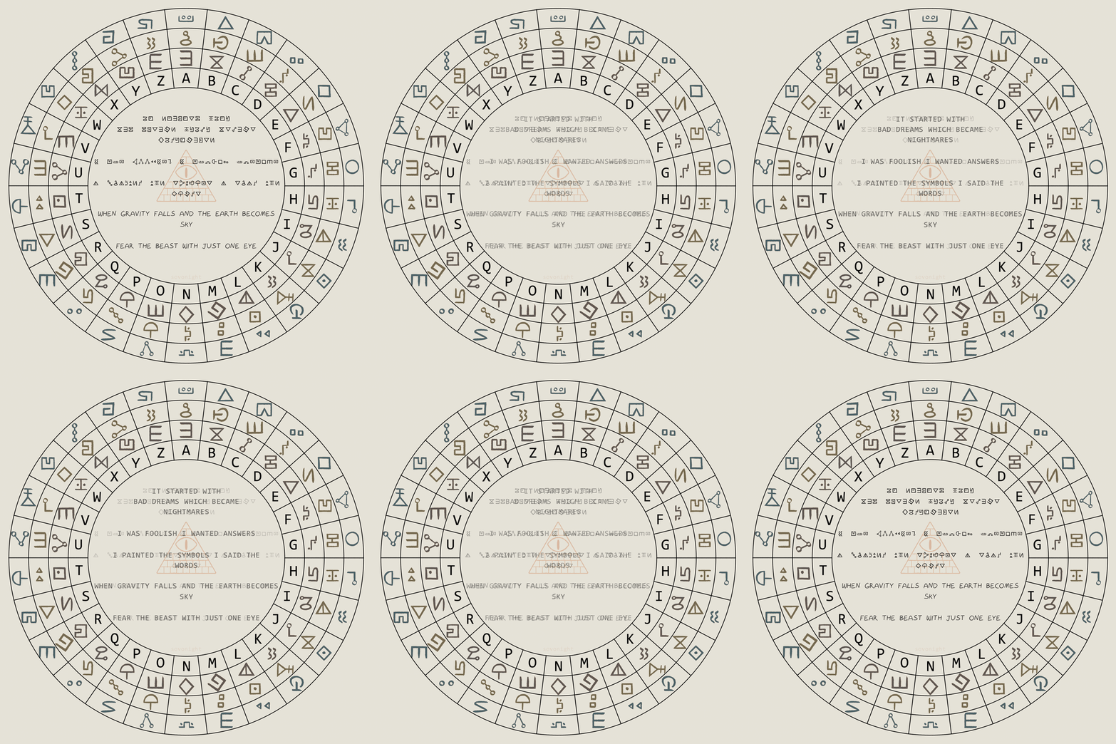
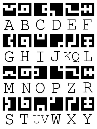
These were the initial character sets we references. A combination of ancient runic characters to establish a fantastical element with a modern twist. The goal was to design it so it felt both ancient and futuristic with a "dark web'esque" twist.
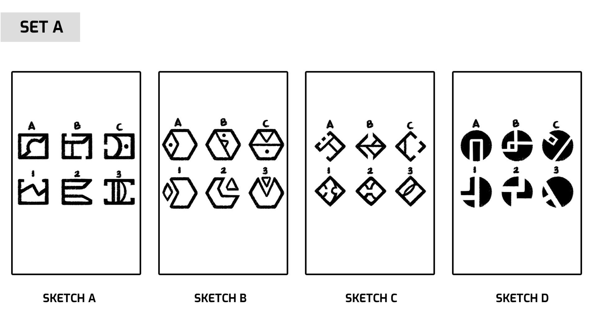
SET A above was the first design exploration delivery. I felt SKETCH was headed in the right direction.
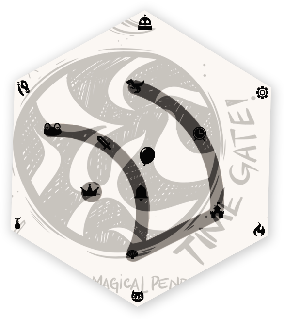
While the hexagonal-shape was one of the ideas we discussed, I thought it felt too "enclosed" and so made suggestions (below) on how to narrow down the next set of mockups.
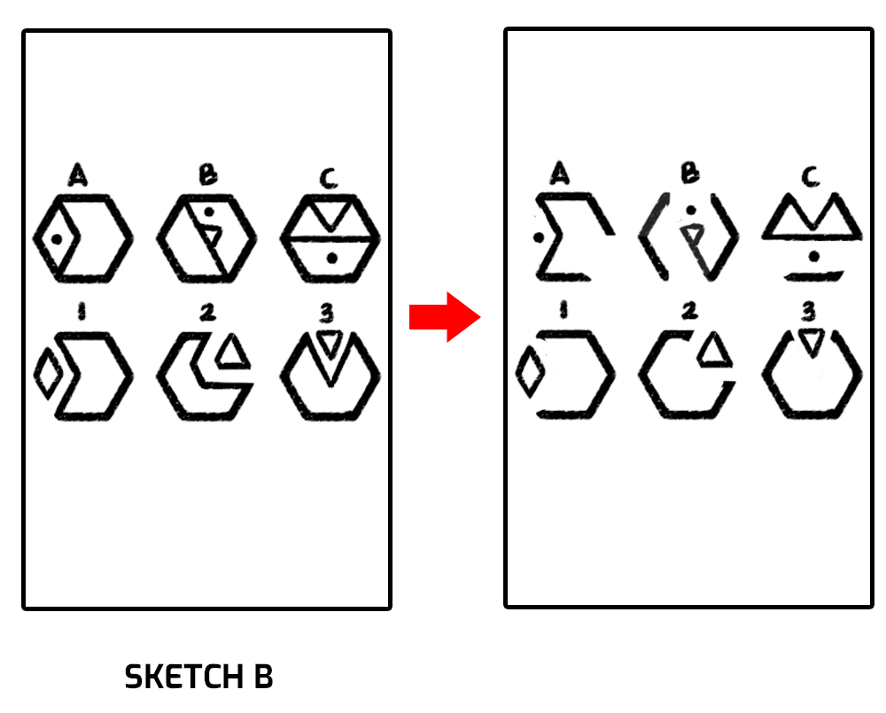
SET B was another round meant to explore more of the design spectrum. I wanted to make sure we weren't limiting ourselves to design elements that may strike inspiration. This turned out to be a key turning point because we ended up narrowing it down further using elements from ALL the above sketches.
With SET C I felt we were finally where we wanted to be. After talking through some design details, we had our first full-alphabet mock-up the next day.
While I was very happy with SET C3 design, I felt there weren't enough distinguishing factors across all the letters and numbers. They all looked too similar.
I wanted to find a way for players to identify certain key details that would hint at what the glyph might be. So after a few days of sitting on it and making design notes, I asked my designer to incorporate these rules:
1. Only VOWELS should contain a dot.
2. Each letter should contain a VERTICAL LINE that increases to a maximum of 3 until the next vowel.
3. VOWELS should look more organic and contain no vertical lines.
4. NUMBERS should contain a small circle instead of a dot.
2. Each letter should contain a VERTICAL LINE that increases to a maximum of 3 until the next vowel.
3. VOWELS should look more organic and contain no vertical lines.
4. NUMBERS should contain a small circle instead of a dot.
90% there. The numbers weren't feeling intuitive enough so we incorporated these rules:
1. NUMBERS should also contain HORIZONTAL LINES that increase in cycles of 3.
2. All PRIME NUMBERS should also contain a half-circle.
3. All NON-PRIME NUMBERS should contain a "V" shape.
2. All PRIME NUMBERS should also contain a half-circle.
3. All NON-PRIME NUMBERS should contain a "V" shape.
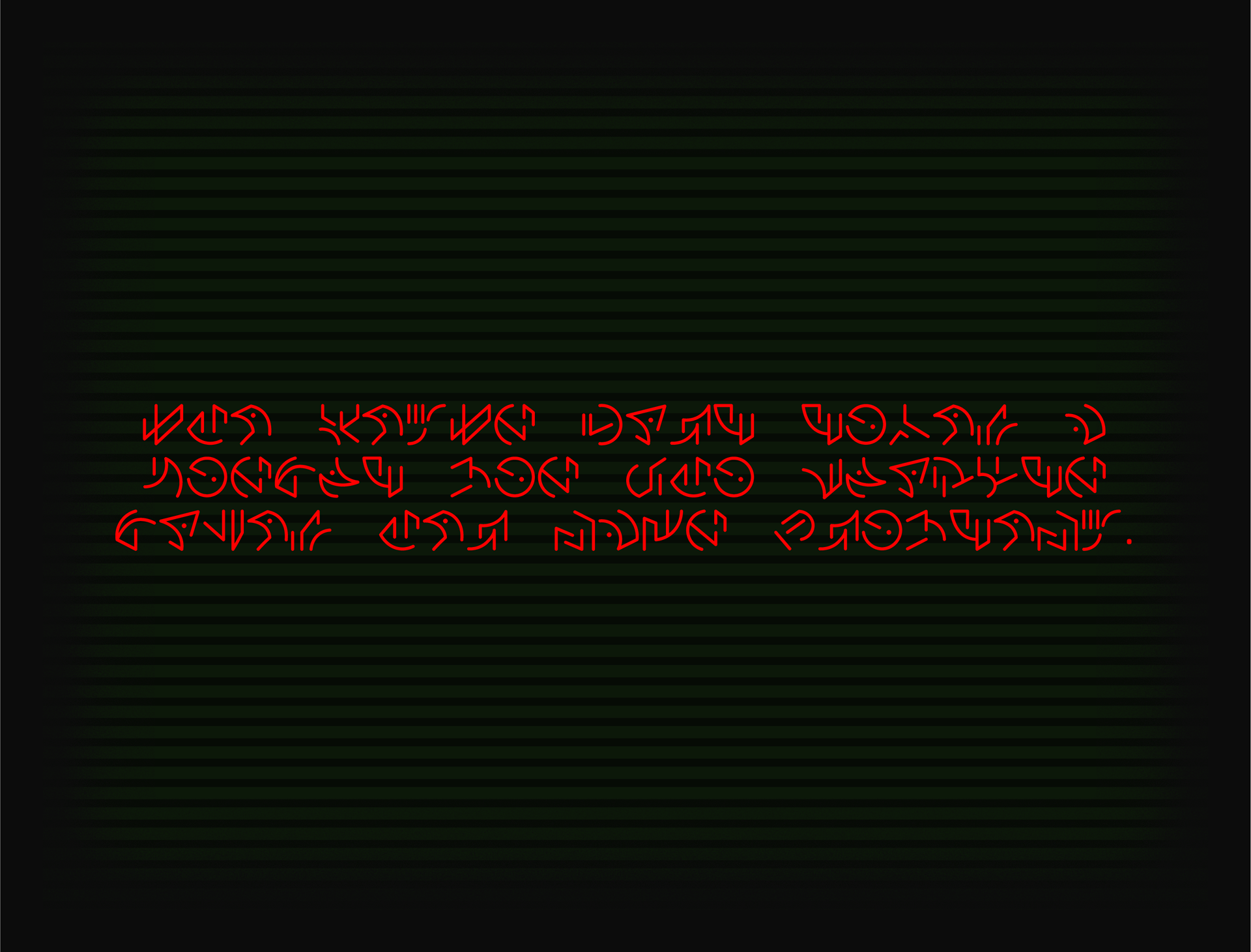
At last, the "Tenretni Olleh" alien glyphs were born.
Click on HERE to download the .TTF file for your own personal use.
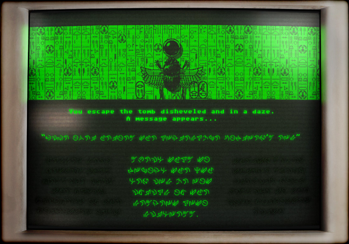
The Tenretni Olleh glyphs in the wild...
